Oooohhh, some exciting news! I'm so happy to announce that I will be contributing to Design Milk with weekly Interior Design posts! I am continuously inspired by Design-Milk and and am so excited to be part of the team. I love collaboration with other artists working with any medium and I think Design Milk does such a great job of showcasing such a range of talent! Thank you so much Jaime for giving me this opportunity and for all the continuous inspiration!
My first post was about the renovation of Kettner's Restaurant by StudioIlse, my favorite! These dramatic interiors come to life and in this case morphed into the leading ladies on these "stages"! Check out the entire post here.
Friday, July 31, 2009
Wednesday, July 29, 2009
Now Imagine Your Holiday Home!
This project by UN Studio will really make you think after you finish gasping. They were commissioned to design a "Holiday Home" which was installed in a gallery at Philadelphia's Institute of Contemporary Art. UN Studio is known for their out of the box thinking and preferring concept over convention as you can see in this faceted, prism like, voluminous work of art. This project was a theoretical approach to the common idea. It is rare that in the real world a designer gets to experiment with these exercises. It always feels so good to go there, you know outside your everyday thoughts, when you are challenged to think just one step further. I feel like the volumes within this space represent different volumes of thoughts. Now what is your dream "Holiday Home"? Funny enough when the architects were asked about theirs they said "a 19th century farmhouse in the Canary islands, completely undesigned"
This project reminds me of one of my favorite classes and projects in college which was "Experimental Design". Our project was to create an apartment within the college of design for an International Professor coming for the Fall. The space was open to the 3 stories above and to the glass ceiling on the College of Design. My space was based on deconstructivism, volumes, and planes. There was no actual ceiling, but all my walls were angled so that as the planes met they created a roof while still allowing the natural light to come in from above. Oh, how I loved projects in college!
What is it?
architecture,
deconstructivism,
MODERN ARCHITECTURE
Tuesday, July 28, 2009
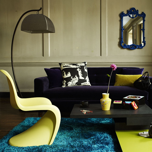
Yellow Just Makes Me Feel Good!
Tonight my cycling instructor played some great music "to make us feel good". Just knowing her intention made me feel good:-) I left class feeling inspired, had such a positive attitude, and a great workout . When it comes to colors, one color that always gives off positive energy and makes me feel good is yellow. What color is it for you?
Here's a random story...when I was in college and lived in my sorority house (yes, I know) we had a bathroom on the Second Floor that was yellow, and one on the 3rd floor that was blue. Everyone always wanted to live on the 2nd floor because the were so energized and loved mornings in the yellow bathroom!
I hope these interiors make you feel good. These have been in my inspiration folder for quite some time so I do not have any references available today. All the image sources are unknown.
Here's a random story...when I was in college and lived in my sorority house (yes, I know) we had a bathroom on the Second Floor that was yellow, and one on the 3rd floor that was blue. Everyone always wanted to live on the 2nd floor because the were so energized and loved mornings in the yellow bathroom!
I hope these interiors make you feel good. These have been in my inspiration folder for quite some time so I do not have any references available today. All the image sources are unknown.
What is it?
eclectic living room,
eclectic modern,
modern bathroom,
modern kitchen,
modern living room,
yellow bathroom,
yellow interiors,
yellow kitchen
Friday, July 24, 2009
Dollops of Color
Interior Stylist Abigail Ahern and owner of the London boutique Atelier Abigail Ahern really knows how to use color. She transformed her all white apartment into this rich, luscious space filled with dollops of bright turquoise, pinks, reds, greens, and yellows. She painted the walls and the floors with this deep seductive hue by Farrow and Ball "Down Pipe". By painting the floors the same color as the wall and keeping the ceiling "Simple White" she was able to add volume to the space.
The art above her fireplace is actually the back of an old road sign...how cool is that!
Another blue kitchen, I just love it! Here she just spray painted her simple Ikea cabinets this beautiful blue called "Deep Water"
You just can't go wrong with a blue flocked Anglepoise lamp.
That one red thread says so much!
How natural and cozy and then that turquoise hiding in the corner just adds that little touch of drama.
I can't get over how amazing this red looks with the deep hue. The sheer volume of that yellow lampshade is just perfect!
What is it?
accessories,
artwork,
bathroom,
bedroom,
blue kitchen,
crocheted bedspread,
eclectic modern,
gold accessories,
gray walls,
interior design,
modern kitchen,
modern living room,
painted floors
Thursday, July 23, 2009
It's a Daydreamin' Kind of Day!
What an amazing week it has been here with my family. I feel like the girl in this image, just sitting back, relaxing, taking everything in, and daydreaming about what is and will be!
As I relax I daydream of beautiful places and I think this space is so beautiful in it's simplicity and perfect detail. The teal panels adds such a calming element to the already serene space while the sculptural details of the furniture and the dimensional textures in the objects and art allow your creative juices flow.
image source lucas allen
What is it?
artwork,
bedroom,
Dining Room,
gray,
modern design,
Modern Dining Table,
vintage chair
Tuesday, July 21, 2009
Green Days!
The freshness and crispness of this space reminds me of a gorgeous summer day in the garden! The bright colored vegetables, the gorgeous green surroundings, and the sun shining happily into the day!
images via Lisa O'Reilly
Welcome Baby Drake!
Wow, what a beautiful day! My brother and his wife welcomed their first baby today! I am an incredibly proud aunt of the beautiful boy, Drake Nicholas, who weighed in at 9lbs. 4oz:-) He was a big one! I am so happy for Nick, Melissa, and Drake, what an amazing day in their lives and I am so glad they allowed me to share it with them! And Grandma Julie and Grandpa Jim are such proud grandparents, congratulations:-)
Monday, July 20, 2009
Iris Maschek Wallpaper
Iris Maschek, from Cologne, has brought her extraordinary designs to life in the Iris Maschek Wallpaper Collection. She has such an avant-garde approach to design and her work truly possesses special qualities. Iris says she always follows her inspirations and intuition and I feel like so much of herself is being revealed in each piece. I am amazed with the detail and depth created in such a simple way! I want these all...NOW!
Saturday, July 18, 2009
Make It a Combo!
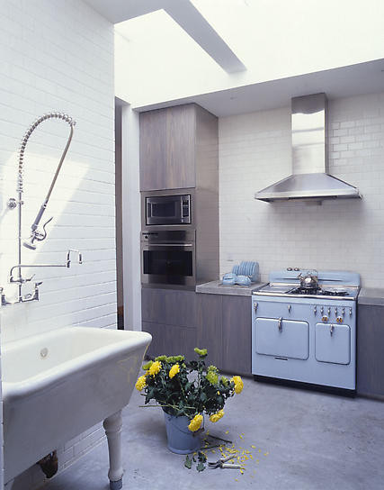
"Refreshingly modern, yet historically aware synergy"...could you say it any better?! The work of James Wagman Architects in this East Village Loft is the perfect hybrid of modern and historical.
I am in awww of this kitchen, I think it's truly incredible! Notice the blue stove!
Shades of Gray and Gold
Wouldn't this be heaven? To hop out of this bed with that gorgeous gray crocheted blanket and hop into this stunning bathtub. And here you go again...the gold accents that I'm obsessing over.
What is it?
artwork,
bedroom,
crocheted bedspread,
gold accessories,
modern bathroom,
modern lighting,
vintage tub
Way Too Cool!
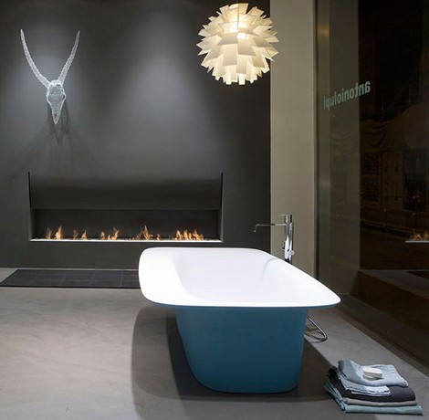
This blue Sartoriale bathtub by Antonio Lupi is gorgeous. I'm seeing blue pop up a lot in kitchens and baths and I'm really digging it! The color and design would work great in any modern or eclectic home. This assymetrical tub is made of cristaplant and it has that ultrasmooth texture and seamless finish. Again, what a sculptural piece!
What is it?
colored bathtubs,
freestanding tub,
modern bathroom
Subscribe to:
Posts (Atom)