It's way past time for a new blog header. I've been thinking about this for quite sometime and came up with these deisgn concepts and am going to try one out for a bit. I am pretty happy with the layout, but not quite sure about the color and the fonts. Can you guys help me out and let me know your thoughts on the below options? Your honesty and feedback is greatly appreciated...I won't be offended...i promise:-)

option 1

option 2

option 3

option 4

option 5

just added option 6

this one is for you Alice
option 7

another one added option 8
PS. This adorable sketchy hen is the artwork of jewelry designer
Christine Kaltoft and I just fell in love with it. The actual image may change, but these are concepts that I am trying out.
 option 1
 option 2
 option 3
 option 4
 option 5
 just added option 6
 another one added option 8
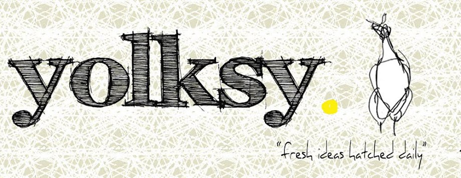
My faves are two and three.
ReplyDeleteI like the word nice and big, makes it even more
iconic.
My faves are one and four, for sure. But not sure if that helps you considering the comment before me...
ReplyDeleteI like number four! It looks good!
ReplyDeleteAnd I really don't like number two. That font looks so strange and I've seen it at too many places now.
#3!
ReplyDeleteI like #4 for the font, and #3 for the color.
ReplyDeleteIt's Alicia...This is tough as they are all wonderful, but my fave is 4. I do love 3 and 5 as well. The font for 2 is a fine font but I don't feel it is right. I just love the font for number 4 but I love stuff sketcy like that....it's like someone freshly hatched that out which ties into the fresh ideas hatched daily. I can just visualize someone sketching that out on the screen or a napkin before me with a new font or idea. I still love the font in option 5. It is sweet, edgy sketchy as well. LOVE the chicken and the egg! I think the font is great for 'fresh ideas hatched daily.' Oh, girl, I love ya and you inspire me! Maybe try out some of the other options at the top as you did the green to get a feel.....Alicia W
ReplyDeleteI was thinking I should try something other than the black white and yellow like i had before, but I just like it too much! Thanks everyone for your ideas! Alice + Hello Tiger I think you're right about font #2...there is something about it that doesn't work. I'll have to use it for something else because I love it! So far looks like #4 is in the lead!
ReplyDeleteI really like the bright green (next to last) and the one you have on right now. Great work!!!!!!
ReplyDeleteI love number 8!! The color is perfect, but you can't ever go wrong with teal and grey in my book!
ReplyDeleteTough decision and thanks again for all the feedback! Monica the seafoam/teal, black, white, gray, and yellow is the color palette for my house (well plus some other crazy colors that got thrown in!) It's very soothing!
ReplyDeleteI like option 4. And 7.
ReplyDelete3 and 4 rock!
ReplyDeleteI like 4 and 6!!!
ReplyDeleteThe winner is #4! Thanks everyone for all the feedback...it very helpful!
ReplyDeletei mean...it WAS very helpful:-)
ReplyDeleteVery nice! 2 years in and I've yet to get myself a blog header!
ReplyDeleteWhoops, I meant #3 and #4, I mismatched the blog headers with the #s. I'm glad you went with #4!
ReplyDelete